


Building App UI with Jetpack Compose Part 1
Exploring Android’s modern toolkit for building native UI


Jetpack Compose is Android’s modern toolkit for building native UI. It is fully declarative, meaning you describe your UI by calling a series of functions that transform data into a UI hierarchy.
Jetpack Compose currently lets you integrate with libraries that you are already familiar with like Navigation, Paging, LiveData (or Flow/RxJava), ViewModel, and Hilt, Compose works with your existing architecture.
In this article, we will be building an investment App UI using Jetpack Compose. This is very basic and you don't need any architecture knowledge to get started.
Let's get to it
What you'll need:
- Android Studio Arctic Fox
- Experience with Kotlin syntax
- Setup your Android Studio
What you'll do:
- Explore Material components
TopBar - Build declarative UI with Composables such as
Text,SurfaceandImage - Use Layout Composables such as
Column,Row,ConstraintLayout
TopBar
Scaffold allows you to implement a UI with the Material Design layout structure using the available slots.
Scaffold(
    modifier: Modifier = Modifier,
    scaffoldState: ScaffoldState = rememberScaffoldState(),
    topBar: @Composable () -> Unit = {},
    bottomBar: @Composable () -> Unit = {},
    ....)

TopBar:optional contains the parameter you will use to style it.text,elevationandnavigationIconModifiers:This allow you to decorate a composable by changing it behaviour and appearance
@Composable
    fun topBar() {
        TopAppBar(title = { Text(text = "") },
            elevation = 0.dp,
            navigationIcon = {
                // show drawer icon
                IconButton(onClick = {}) {
                    Icon(
                        painter = painterResource(id = R.drawable.ic_show_chart),
                        contentDescription = null
                    )
                }
            },
            actions = { IconButton(onClick = {}) {
                    Icon(
                        imageVector = Icons.Filled.Search,
                        contentDescription = "Search"
                    )
                }
            }
        )

    }
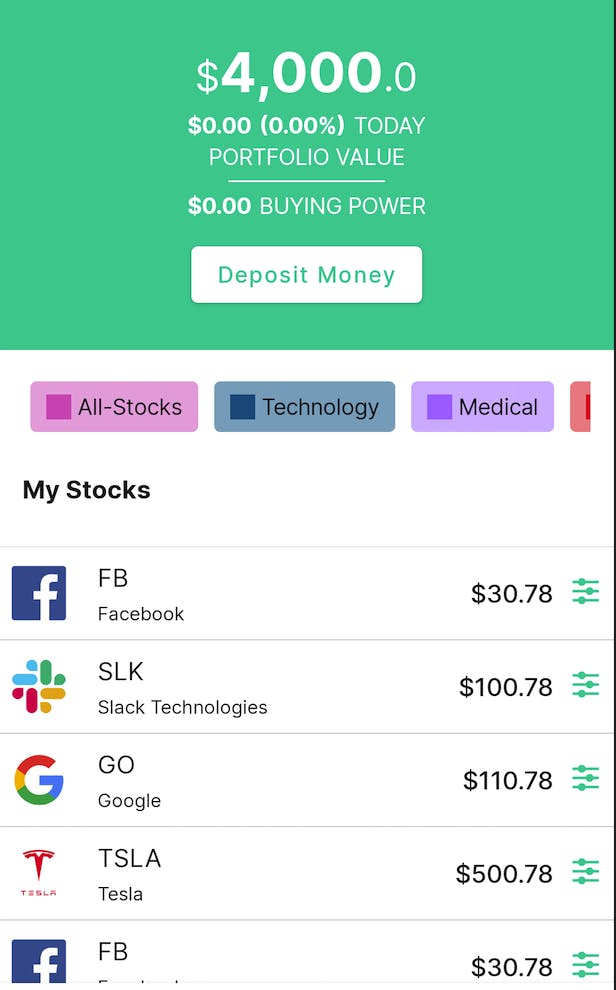
Wallet Section
Here you will be using composable like:
Text: Display textButton: Create action button and Click actionsColumnandRow: flexible layout composables to place items (vertically and horizontally, respectively)ConstraintLayoutcan help you place composables relative to others on the screen
Wallet Balance with ConstraintsLayout
@Composable
fun balanceLayout() {
    ConstraintLayout(
    ) {
        val (currency, balance, trailing) = createRefs()

        Text(
            "$", Modifier.constrainAs(currency) {
                bottom.linkTo(balance.bottom, margin = 4.dp) },
            style = MaterialTheme.typography.body1,
            color = Color.White)
        Text(
            "4,000", Modifier.constrainAs(balance) {
                top.linkTo(parent.top, margin = 16.dp)
                start.linkTo(currency.end) },
            style = MaterialTheme.typography.h1,
            color = Color.White)
        Text(
            ".0", Modifier.constrainAs(trailing) {
                start.linkTo(balance.end)
                bottom.linkTo(balance.bottom, margin = 4.dp) },
            style = MaterialTheme.typography.body1,
            color = Color.White)
    }
}

val (currency, balance, trailing) - createRefs()- Create constraint reference for composablesModifier.constrainAs(reference)- A Modifier that defines the constraints, as part of a ConstraintLayout, of the layout element.
Constraints are passed to the composable within the Modifier constrainScope
        Text(...,
                 Modifier.constrainAs(trailing) {
                start.linkTo(balance.end)
                bottom.linkTo(balance.bottom, margin = 4.dp) },
                   ........)
Flexible composable layouts Columnsand Rows
Column:is used to place items in a vertical sequence.Row:to place items horizontally.
Other composables of the wallet view are grouped using Column and the Modifier
.fillMaxWidth() is used to set Width to fix the screen width. Also the background color .background(color = MaterialTheme.colors.primary)
fun WalletView() {
Column(
modifier = Modifier
.fillMaxWidth()
.background(color = MaterialTheme.colors.primary),
horizontalAlignment = Alignment.CenterHorizontally
) {
balanceLayout()
Row() {
Text(
"$0.00",
color = Color.White,
style = MaterialTheme.typography.h3,
)
Spacer(modifier = Modifier.width(5.dp))
Text(
"(0.00%)",
color = Color.White,
style = MaterialTheme.typography.h3,
)
Spacer(modifier = Modifier.width(5.dp))
Text(
"TODAY",
color = Color.White,
style = MaterialTheme.typography.body2,
)
}
Text(
"PORTFOLIO VALUE",
color = Color.White,
style = MaterialTheme.typography.body2,
)
Spacer(modifier = Modifier.height(10.dp))
Divider(
color = Color.White,
thickness = 1.dp,
modifier = Modifier.width(100.dp)
)
Spacer(modifier = Modifier.height(10.dp))
Row() {
Text(
"$0.00",
color = Color.White,
style = MaterialTheme.typography.h3,
)
Spacer(modifier = Modifier.width(5.dp))
Text(
"BUYING POWER",
color = Color.White,
style = MaterialTheme.typography.body2,
)
}
Spacer(modifier = Modifier.height(16.dp))
Button(colors = ButtonDefaults.buttonColors(
backgroundColor = Color.White
), onClick = { /*TODO*/ }) {
Text("Deposit Money", color = MaterialTheme.colors.primary)
}
Spacer(modifier = Modifier.height(30.dp))
}
}

Working with list
Jetpack Compose makes it easy to display a list of items using Column and Row composables.
Featured Theme Chip item and list
@Composable
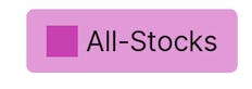
fun Chip(text: String, color: Color) {
Surface(
Modifier.padding(5.dp),
shape = RoundedCornerShape(4.dp),
color = color.copy(alpha = 0.5f)
)
{
Row(
modifier = Modifier.padding(start = 10.dp, top = 6.dp, end = 10.dp, bottom = 6.dp),
verticalAlignment = Alignment.CenterVertically
) {
Box(
modifier = Modifier
.size(16.dp, 16.dp)
.background(color = color)
)
Spacer(Modifier.width(4.dp))
Text(text = text, style = MaterialTheme.typography.body2)
}
}
}
val stockGroup = listOf(
"All-Stocks",
"Technology",
"Medical",
"Entertainment"
)
val colors = listOf(
Color(0xFFDB5DBD),
Color(0xFF025889),
Color(0xFFAB75FB),
Color(0xFFED1D23)
)
The composable will get title and color dynamically from an array of list
Surface:This serves as a background for the chip and has style slots forcolor,shapeandModifierBox:allows you to have items behind and/or in front of others. Also, no content can participate in layout
LazyRow is used to render a horizontally scrolling list that only composes and lays out the currently visible items. Here you will be able to display the featured theme chip as a horizontally scrolling list.
@Composable
fun chipList() {
val scrollState = rememberLazyListState()
LazyRow(state = scrollState) {
items(count = stockGroup.size) { index ->
Chip(
text = stockGroup[index],
color = colors[index]
)
}
}
}
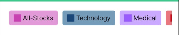
val scrollState = rememberLazyListState(): This save the scrolling position of an item
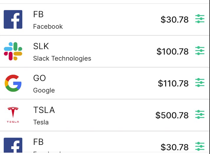
Stock list
Here, you will be required to display an image using Image composable
Image(
painter: Painter,
contentDescription: String?,
modifier: Modifier = Modifier,
alignment: Alignment = Alignment.Center,
contentScale: ContentScale = ContentScale.Fit,
alpha: Float = DefaultAlpha,
colorFilter: ColorFilter? = null
)
painter:set the image to a specified bounded area
@Composable
fun stockItem(stockImage: Int, name: String, symbol: String, amount: String) {
ConstraintLayout(
Modifier
            .fillMaxWidth()
.padding(8.dp)
) {
val (iconId, symbolId, amountId) = createRefs()
Row(Modifier.constrainAs(iconId) {
start.linkTo(parent.start, margin = 15.dp)
top.linkTo(parent.top)
bottom.linkTo(parent.bottom)
}) {
Image(
painter = painterResource(id = stockImage),
contentDescription = null,
Modifier
.height(35.dp)
.width(35.dp)
)
Spacer(Modifier.width(20.dp))
}
Column(Modifier.constrainAs(symbolId) {
start.linkTo(iconId.end)
}) {
Text(
symbol,
style = MaterialTheme.typography.body2.copy(fontSize = 16.sp)
)
Spacer(Modifier.height(3.dp))
Text(
name,
style = MaterialTheme.typography.body2.copy(fontSize = 12.sp)
)
}
Row(
Modifier.constrainAs(amountId) {
end.linkTo(parent.end, margin = 15.dp)
top.linkTo(parent.top)
bottom.linkTo(parent.bottom)
}
) {
Text(
amount,
style = MaterialTheme.typography.body2.copy(
fontSize = 16.sp,
fontWeight = FontWeight.Medium
)
)
Spacer(Modifier.width(10.dp))
Image(
painter = painterResource(id = R.drawable.ic_equalizer),
contentDescription = null,
Modifier
.height(20.dp)
.width(20.dp)
)
}
}
}
painterResource(id = stockImage): This take @DrawableRes reference of images stored in your drawable folder.
StockItem(R.drawable.facebook, "Facebook", "FB", "$30.78")

Create an Array of StockItem to populate the list of stocks. This can come from an external datasource depending on your project requirements.
var dummyStocks = listOf(
    StockItem(R.drawable.facebook, "Facebook", "FB", "$30.78"),
    StockItem(R.drawable.slack, "Slack Technologies", "SLK", "$100.78"),
    StockItem(R.drawable.google, "Google", "GO", "$110.78"),
    StockItem(R.drawable.tesla, "Tesla", "TSLA", "$500.78"),
    StockItem(R.drawable.facebook, "Facebook", "FB", "$30.78"),
    StockItem(R.drawable.slack, "Slack Technologies", "SLK", "$100.78"),
    StockItem(R.drawable.google, "Google", "GO", "$110.78"),
    StockItem(R.drawable.tesla, "Tesla", "TSLA", "$500.78")
)
Use the LazyColumn to display the list of stocks which renders only the visible items on the screen, allowing performance gains and doesn't need a scroll modifier.
LazyColumn has a DSL to describe its list content. You will use items, which can take a number as the list size. It also supports arrays and lists. Read more here
 LazyColumn(state = scrollListState) {

        items(count = dummyStocks.size) { index ->
            Divider(modifier = Modifier.padding(horizontal = 15.dp),  color = dividerColor, thickness = 0.5.dp)
            stockItem(
                stockImage = dummyStocks[index].icon,
                name = dummyStocks[index].name,
                symbol = dummyStocks[index].symbol,
                amount = dummyStocks[index].amount
            )
            Divider(modifier = Modifier.padding(horizontal = 15.dp),color = dividerColor, thickness = 0.5.dp)
        }
      }
Divider:is a thin line that groups content in lists and layoutSpacer:represents an empty space layout, whose size can be defined usingModifier.width
At this point, we are done creating the independent composables views. The next step will be to put them together. Since the composable on the screen will have vertical scroll behaviour, we wrap them in a LazyColumn using it DSL to describe its contents.
class MainActivity : AppCompatActivity() {
    override fun onCreate(savedInstanceState: Bundle?) {
        super.onCreate(savedInstanceState)
        setContent {
            WalletScreen()
        }
    }
}

@Preview(showBackground = true)
@Composable
fun WalletScreen() {
    val scrollListState = rememberLazyListState()
    LazyColumn(state = scrollListState) {
        item {
            Column(
                modifier = Modifier
                    .fillMaxSize(),
            ) {
                WalletView()
            }
        }
        item {
            stockView()
        }
        items(count = dummyStocks.size) { index ->
            Divider(modifier = Modifier.padding(horizontal = 15.dp),  color = dividerColor, thickness = 0.5.dp)
            stockItem(
                stockImage = dummyStocks[index].icon,
                name = dummyStocks[index].name,
                symbol = dummyStocks[index].symbol,
                amount = dummyStocks[index].amount
            )
            Divider(modifier = Modifier.padding(horizontal = 15.dp),color = dividerColor, thickness = 0.5.dp)
        }
        item {
            Spacer(Modifier.height(40.dp))
        }
    }
}
Great, we are done creating the Wallet Screen using Jetpack Compose. In the next part of this article, we will be looking at how to add Bottom Navigation Bar and handling screen navigation.
See full code here
If you found it helpful, holla at me @hinsikak on Twitter